What I Do, What People See
Expired| Do | See |
|---|---|
| > Research and interviewing | > |
| > Usability testing (writing, validating, administering) | > |
| > Evaluating and presenting test results | > |
| > Creating personae | > |
| > Design strategy and product design | > |
| > Requirements, feature, and flow documentation | > |
| > Interaction design | > |
| > Information Architecture | > IA |
| > Interface Design | > Design |
| > Visual Design | > Design in the Small |
| > Usability | > Usability |
| > Prototyping | > |
| > Taxonomy and terminology creation | > |
| > Customer presentation and demos | > |
| > Working with business and development teams | > |
| > UX leadership and education | > |
You see the problem.
This page was inspired by a blog post of Erik Flowers called "UX is not UI". He also credits Dan Willis and Elisabeth Hubert.
- Details
Users Can't Find Their Stuff
Expired|
Before |
|
 |
Problems:
|
|
After |
|
|
Solutions:
|
Return to Problems and Solutions
- Details
Users Can't Control Publishing
Expired|
Before |
|
 |
Problems
|
|
After |
|
 |
Solutions
|
Return to Problems and Solutions
- Details
Usability Methods
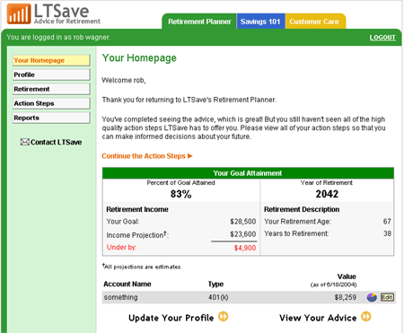
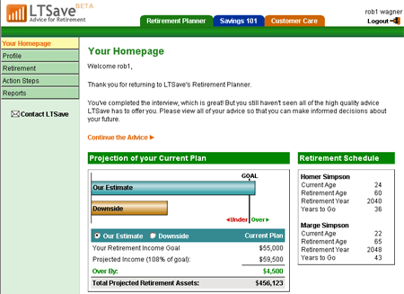
ExpiredThis page shows a redesigned customer experience from LTSave's Online Retirement Planner Web application. To get started, we built a wizard process that guided people through a series of steps. However, user testing of the application's home screen showed that customers were discouraged from continuing.
We discovered when testing an unrelated part of the Web site that a graphical presentation encouraged more customer engagement. By using the graphical presentation on the home screen, we encouraged customers to engage with the product and as a side benefit were able to present more information, encouraging repeated use. Discovering what appealed to customers let us focus on the right improvements.
Usability methods employed during the design included:
- Cognitive walkthrough
- Expert evaluation
- Task-based user testing
|
Before |
|
 |
Challenge:
|
|
After |
|
 |
Resolution:
|
- Details