
In late 2012 I began work on designing a mobile iPad-targeted version of Wedbush's ClientLink application. This will be an up-to-date version of Wedbush's legacy retail client investment system. The current implementation is Web-based and uses outdated technologies. As part of the refresh, Wedbush wants a mobile app that gives high net worth customers access to the ClientLink functionality through a tablet device. The project sponsor chose to target iPad only for the first release.
The sketches below sample different stages in evolving the design, including rough and detailed concept sketches made with Balsamiq. Following that are two detailed visualizations created in Photoshop: a "high color" and a "low color" alternative.
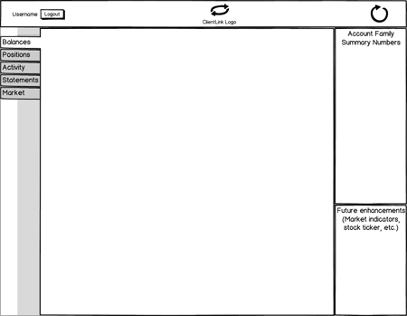 |
The most basic layout concept incorporated feedback from our internal stakeholders on what the important top-level items were and ideas for future enhancements. |
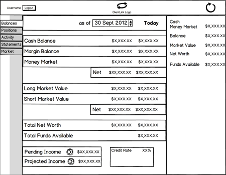 |
The basic layout was then fleshed out with dummy data, showing how the requirements for a given screen would be translated on the iPad's horizontal orientation. Vertical orientation screen layout sketches were also done. After another round of feedback from stakeholders we condensed the design so that the horizontal and vertical orientation use the same layout. We expect this will be less confusing to users (assumption to be tested). |
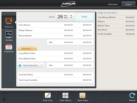 |
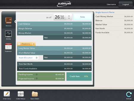
The graphic designer took the rough layouts and produced two pixel-detailed design prototypes. The alternatives we explored used low color (shown here) and high color (below). This version relies solely on visual layout grouping to convey organization. |
 |