
Interaction is made up of moments large and small. Paying attention to the small makes the large easier.
As part of the Lime Brokerage Portal system we made iterative improvements to a simple widget for user input. Each solution has solved some problems, but revealed new ones. This page describes three generation of input controls and why we looked for a fourth.
V1 - Standard Text Input
Like other widget sets, the Flex environment supports simple text inputs - users type and letters appear. This is fine for unconstrained input but in our application the text input often has meanings we know ahead of time. For example, a text string may be a stock ticker symbol (opens in new window).
V2 - Suggest, Don't Validate
In our first version we had allowed unconstrained text input, and attempted to validate the typing afterward against a known list of valid symbols. This turned out to fail because the reference lists are not updated fast enough. This meant that valid user inputs were rejected. In our second version we abandoned validation in favor of suggestion lists, as shown below.
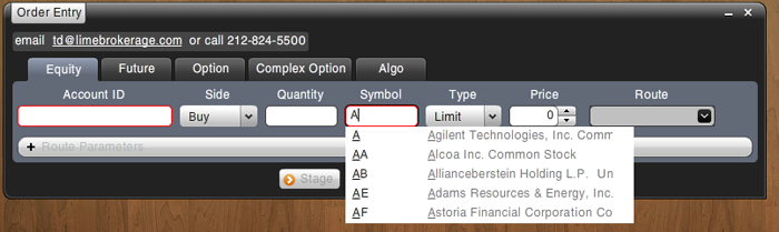
Here the user has typed a character and the system generates a list of suggested completions. This is an example of the autocomplete design pattern (opens in new window).
From the user's point of view, autocomplete served as a kind of "soft" validation and it got a much higher positive feedback when we put it into production. It also revealed another problem: Users wanted some way to know that they were typing valid symbols once the suggestion dropdown was removed, particularly because the system wasn't preventing them from typing invalid symbols.
By fixing one problem, we had revealed another: sometimes a valid input is a strict substring of another valid input - how do users know they've stopped at the right point?
V3 - Making Soft Validation Visible
This led us to evolve a third-generation input control: a marking autocomplete, which is illustrated below.
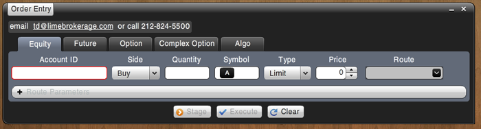
In this control once the user has made a selection their input is turned into a visible marked area - white text on a dark background. This indicates visually that a valid selection was made from the list. Users are still free to enter text that is not on the list as before.
V? - Visible Validation with Space Constraints
This solution worked well for inputs such as a single symbol, and was expanded to cover other areas where users input values from a list, which revealed another problem:
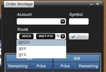
Here the widget is used for a form that permits multiple values in one area. As you can see the visible validation markers take up a large amount of space, making additional input and editing of input extremely difficult, another problem we never would have noticed if we had not solved the previous one.