
Delivering value to users is rarely done all at once. Iteration and feedback lead to improvements that lead to new discoveries and better results.
Charles River supports a FIX network for clients. Each connection involves a series of engines, another series of servers, and configurations that link the two.
Setting these up had been a sticking point in the past and we began with a design that had detailed configuration information. Working with members of the FIX operations group led us first to simplify the presentation, and then to do a whole redesign based on tasks and needs we discovered while discussing early iterations. After the final design iteration set-up time was reduced by 75% overall.
Iterating design let us respond to emergent needs and refocus on FIX network users' current problems, which had changed in the months since requirements were originally gathered. Usability assumptions should come with expiration dates; iterative design keeps those assumptions fresh.
Iterative Design
Original Design
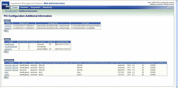
View larger image (new window)
The original design was based on user requirements for detailed configuration information.
We produced an initial prototype that met the requirements but felt "wrong" to the design team. To validate our feelings we engaged FIX network users to see if they could make use of these large tables.
As we suspected, the amount of information made it hard to find key facts. Users also did not see the "New" button and only some realized they could click on the names to perform operations.
Intermediate Design
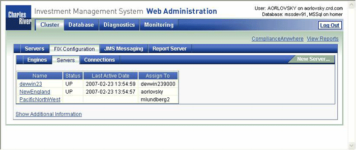
View larger image (new window)
This iteration broke up the large page into three smaller pages. Tables were simplified, showing only the key data, with an "additional information" link for workflows that needed the full detail.
Users were able to complete sample tasks with this design, and the simpler table made clear that names were clickable links. However, they missed having the overall view from before and the attempt to place the "New" link in the upper right did not work.
Final Design
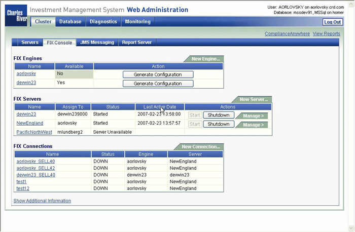
View larger image (new window)
What finally emerged was much more of an operational console than a configuration screen. Iterating had not just validated our feelings, but had sent us in a new design direction.
We brought back the one-page approach, but retained the simplifications in data. We also enhanced the screen with one-button access to important tasks and direct links to detailed management screens.