
This page shows a redesigned customer experience from LTSave's Online Retirement Planner Web application. To get started, we built a wizard process that guided people through a series of steps. However, user testing of the application's home screen showed that customers were discouraged from continuing.
We discovered when testing an unrelated part of the Web site that a graphical presentation encouraged more customer engagement. By using the graphical presentation on the home screen, we encouraged customers to engage with the product and as a side benefit were able to present more information, encouraging repeated use. Discovering what appealed to customers let us focus on the right improvements.
Usability methods employed during the design included:
- Cognitive walkthrough
- Expert evaluation
- Task-based user testing
|
Before |
|
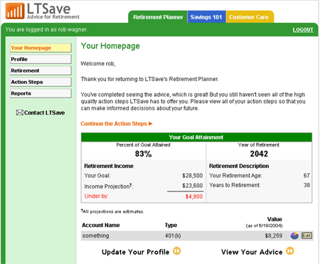 |
Challenge:
|
|
After |
|
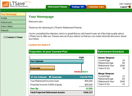 |
Resolution:
|